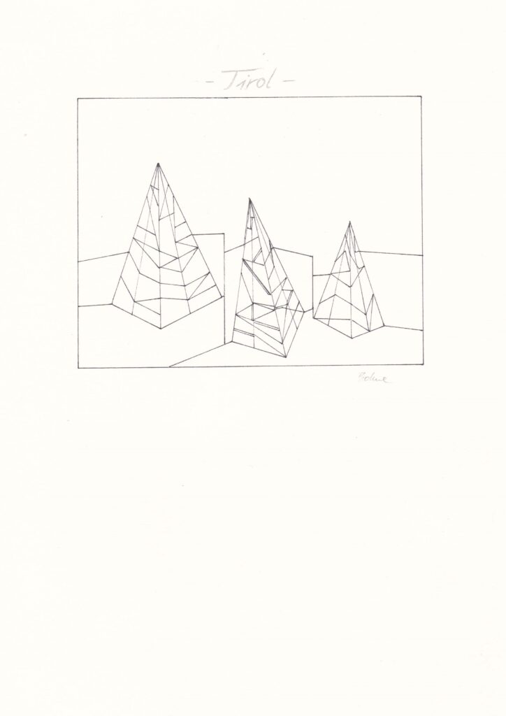
Minimalist graphic design of a strongly hilly landscape in Austria.

Minimalist graphic design of a strongly hilly landscape in Austria.


This is an old nature study of a cushion. Folds – not so good, maybe I’ll try again soon in a better way.


I had once cut out this study for an art folder, so I don’t have a shadow, but maybe I should do it again. I think when it’s time for strawberries again, I’ll try it at my current drawing level.

Today I would like to introduce you to a relatively old nature study. It was made by me around 2011. I used watercolour and a few coloured pencils. Here, some shadow is definitely needed to create depth/spatiality.
In case you wonder why this cucumber looks so strange, depicting rotting vegetables and fruits was very trendy back then, at least in my perception.
© 2024 Berthe
Theme by Anders Norén — Up ↑